Buns | Art Direction
Buns | Art Direction
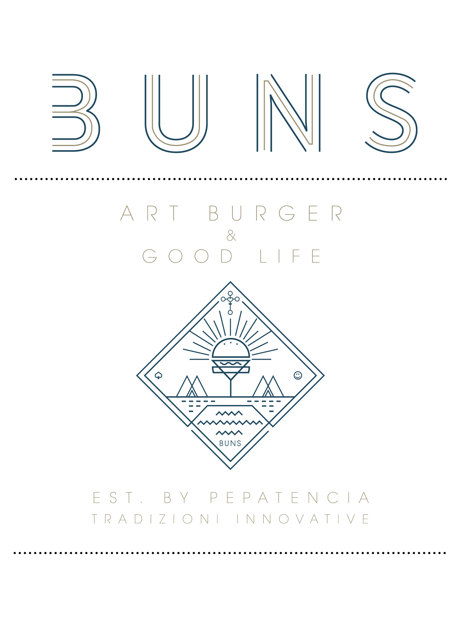
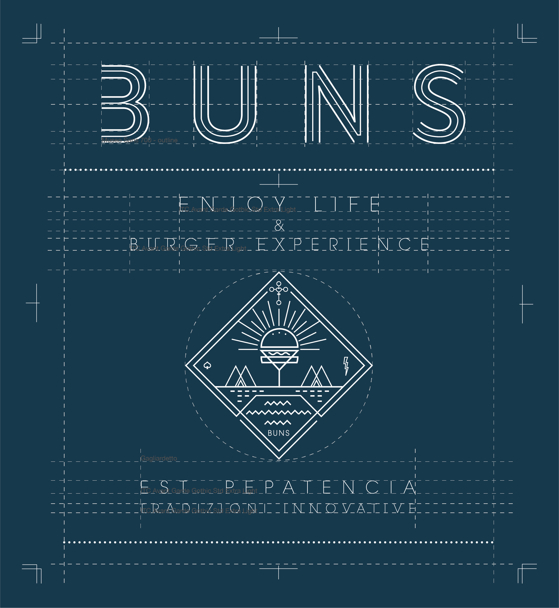
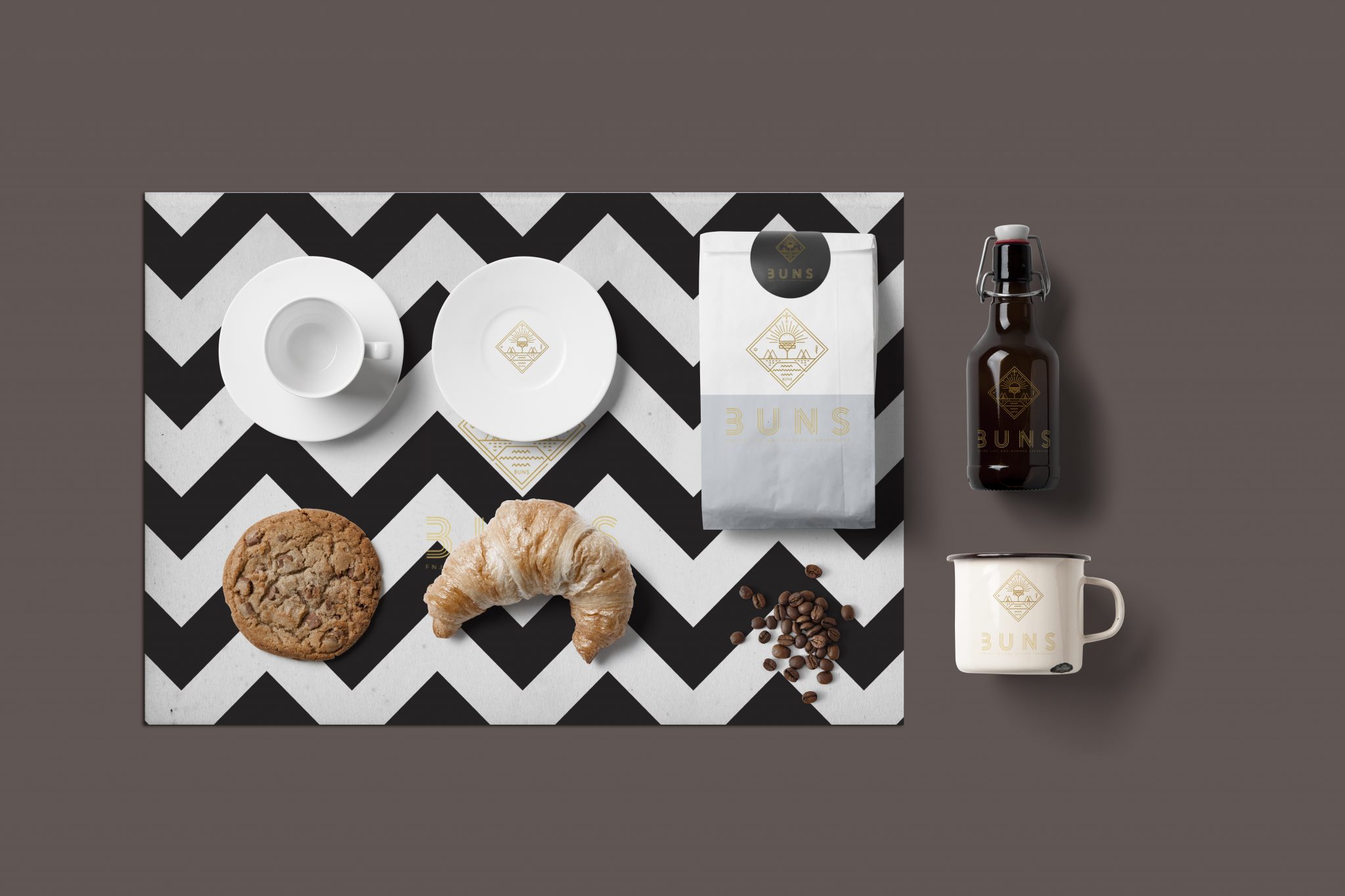
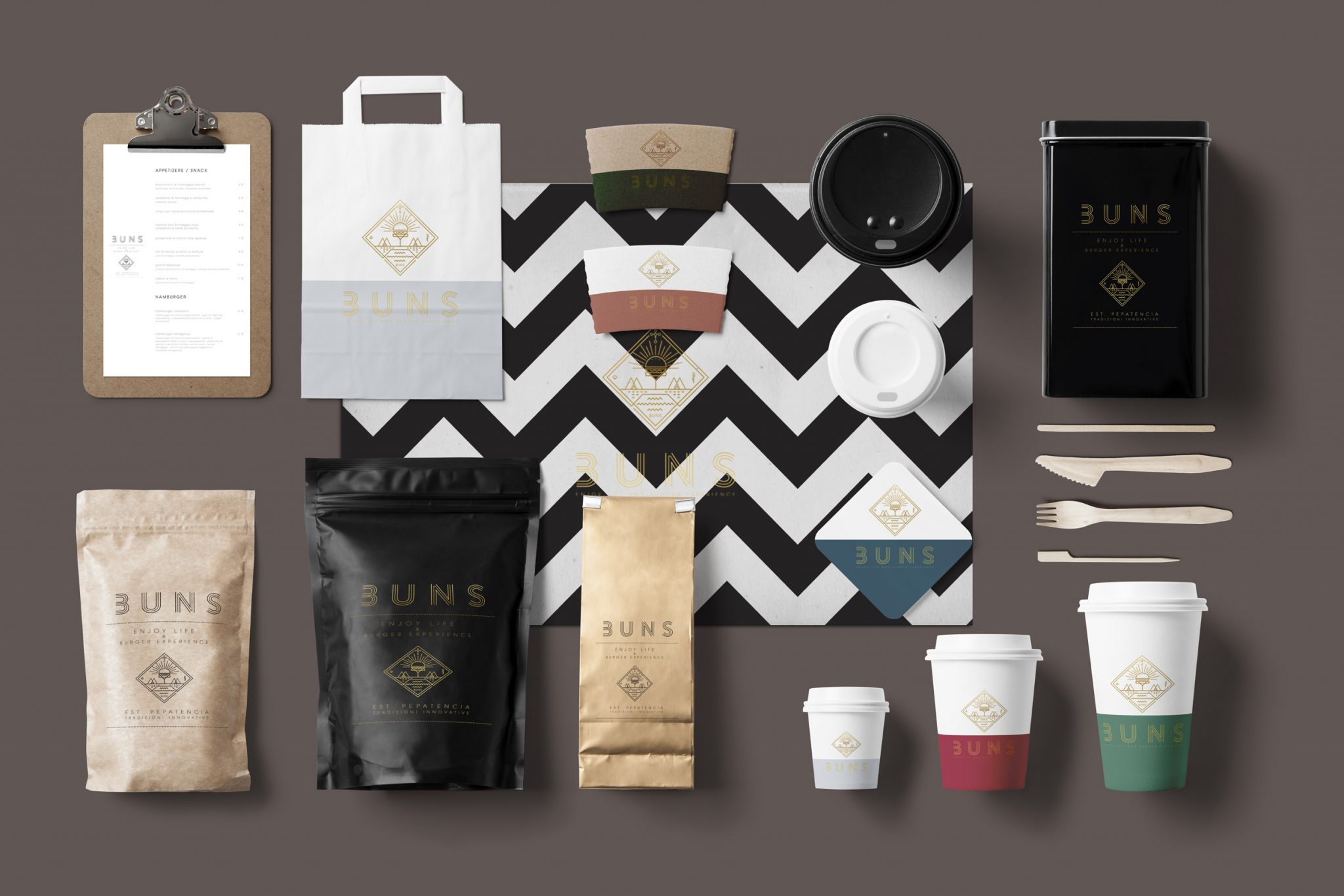
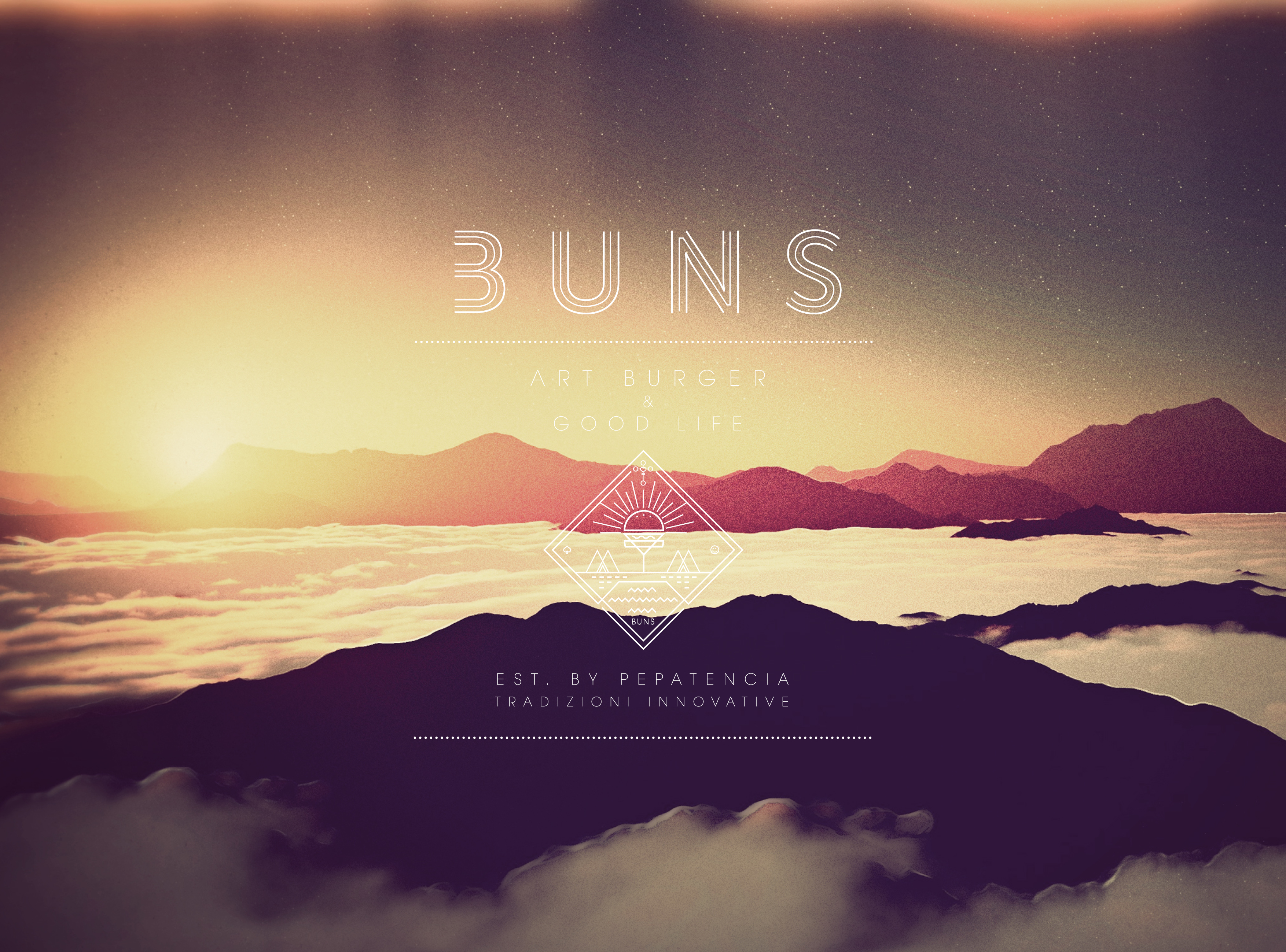
The graphic project,brand logo and coordinate image, elaborated the variety and complexity of the trading offer of the new format.
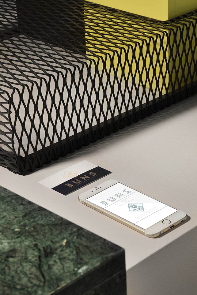
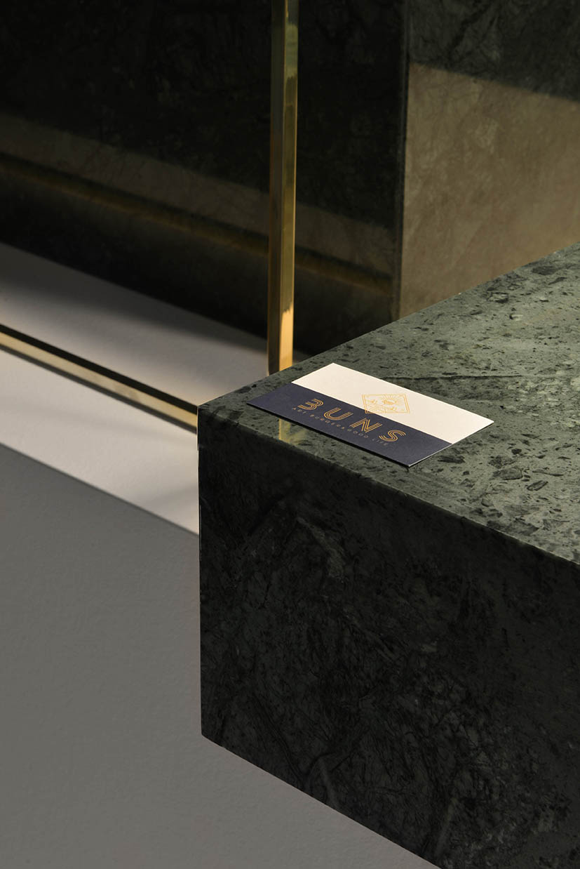
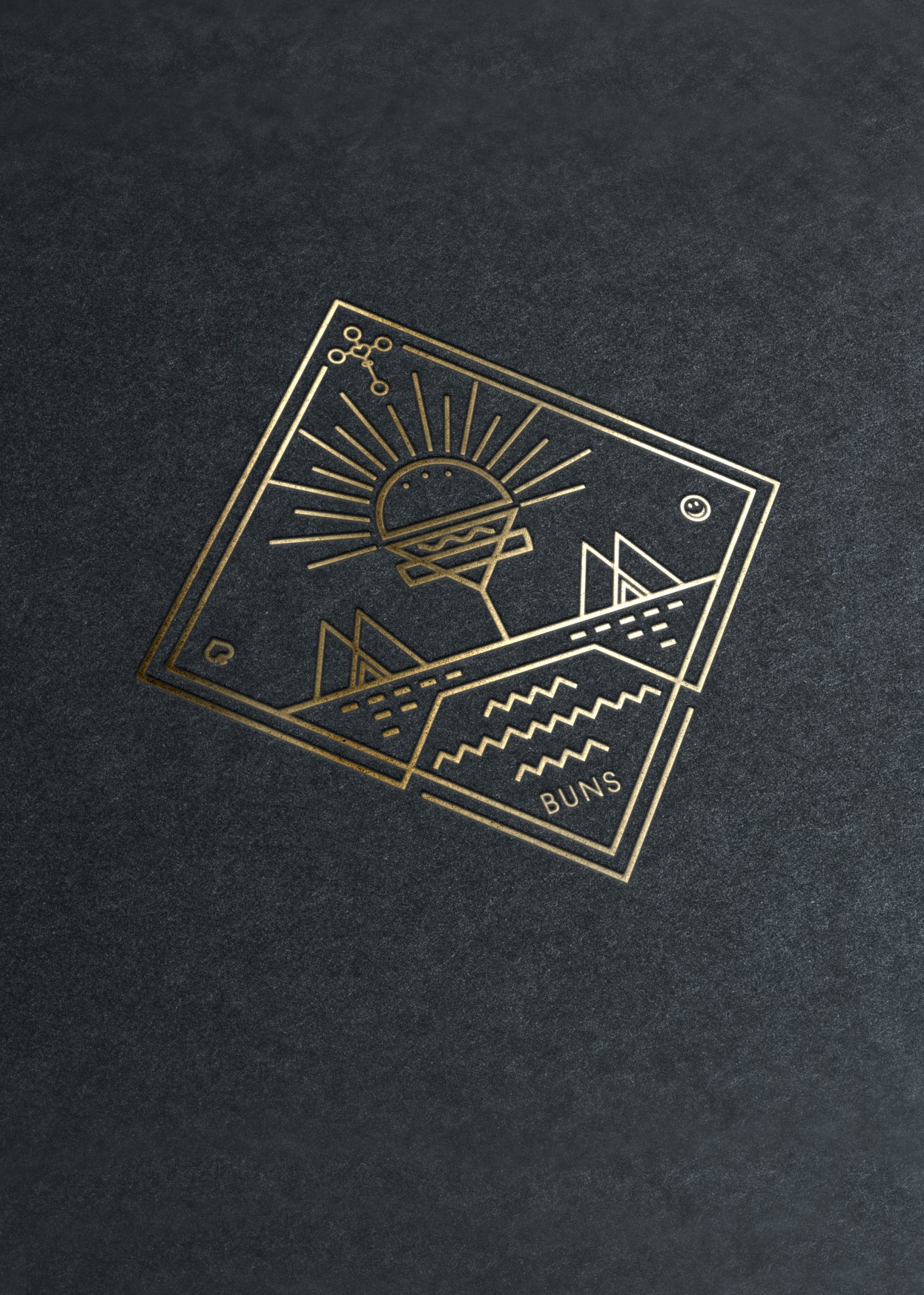
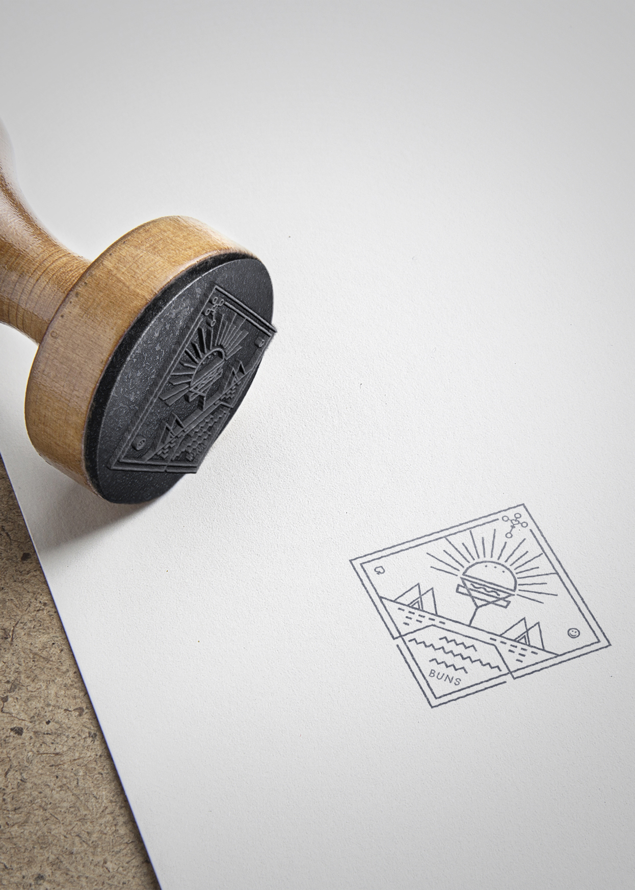
The brand logo came from the mixing of two main elements, cocktail and hamburger which are collocated in the middle creating an unique recognisable element, making a Divine rapresantation. There are some other references such as the symbol of the spades, a tribute to the previous venue and a recall to the iron crown symbol of Monza, location of the bussiness. The corporate identity is perfectly integrated with the architecture and design of the restaurant, generating a series of unique and unmistakable reference points.
